Picture Graph: Definition, Examples, Practice Math Problems
reviewed by Jo-ann Caballes
Updated on November 12, 2024
Welcome to Brighterly, where we make math fun and easy to solve! In this article, we are going to look at picture graphs. We will discover the picture graph definition, its examples, and its real-life applications.
You will also learn about the different parts of a picture graph and how to read them. We will mention when a pictograph should be used, and provide you with solved math tasks alongside practice problems to solve. Also, don’t forget to check out our picture graph worksheets to have fun while practicing.
What is a Picture Graph?
A picture graph or a picture of a graph is a method of presenting information in the form of pictures or icons. To understand it further, let’s check what is meant by the terms “picture” and “graph.”
A picture is an object or a representation of a real-life object or event. A graph is a method of displaying data in a manner that makes it easy to understand.
Therefore, when put together, a picture graph is a very easy way to display data visually.
This is because picture graphs are usually used when it comes to teaching kids numbers.
Instead of reading lots of numbers, they can just count the pictures! The pictures are connected to the data, for instance, a graph picture of celebrities to illustrate students’ favorite sports teams.
Definition of Pictograph
A pictograph or a picture graph is one of the best methods of presenting data in pictures or symbols. Picture graphs focus on the representation of numbers through images so as to allow the information as contained in the graphic to be understood at first glance.
Every picture in a pictograph chart represents a given number of things or occurrences. This pic of a graph assists you in easily grasping how frequently an event happens, and for this reason, pictographs are extremely helpful.
For instance, if you are trying to understand a “pictograph chart” about apples, one apple picture may represent 5 real apples.
Pictographs are significant because they make data easily understandable at a single glance. Well, instead of watching numbers, you can watch entertaining pictures and learn from them.
Pictographs are especially good for kids because they rely on pictures to explain math concepts.
The most commonly used pictograph examples include the number of books read by students or the number of cars that went past a particular street.
The main idea that can be derived from a pic of graph is the meaning of each picture which is often explained beside the graph.
Parts Of A Picture Graph
A picture graph is divided into various parts and each part assists in presenting data in the best manner. We have the title, categories, symbols, scale, pictograph key, and labels.
- Title: This gives us information on what the graph is all about.
- Categories: They indicate the type of data that is being compared.
- Symbols: The symbols or a pictograph picture represent amounts, where a picture has a specific value.
- Scale: The scale of a pictograph is the number that each symbol represents.
- The pictograph key: This shows what each symbol represents and how to interpret the graph. The labels provide names for the categories and the data shown. When you have a clear pictograph key you can easily understand what the information is telling you and solve math problems!
All these parts, when put together, help to make a picture graph easy to read.
Picture Graph Example
Now let’s look at an example of a picture graph:
Example: Favorite Fruits of Students
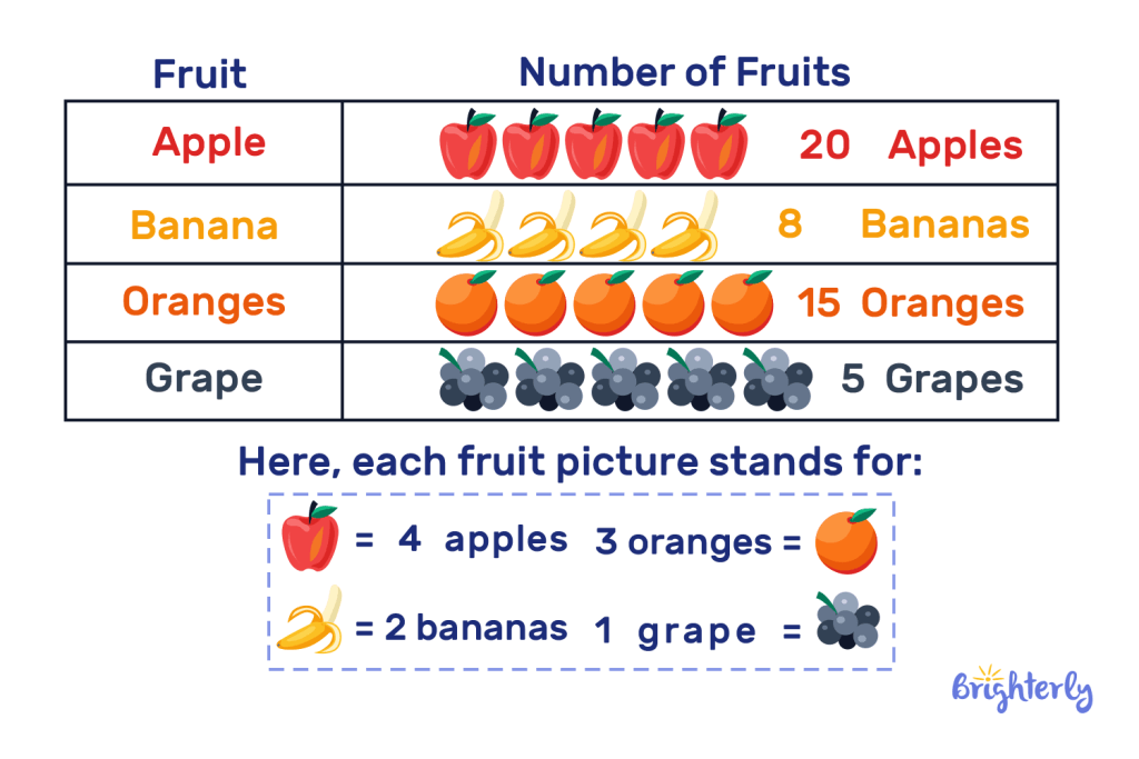
Suppose you want to show how many fruits you have. Here’s the data:

By looking at the graph, it’s easy to see that apples are the most popular fruit!
Picture Graphs: How To Read and Interpret
It is very simple and enjoyable to read and understand pictographs. So, let’s start with the basics and take it from there so that you can become an expert.
- Take note of the theme: First, read the title to get an idea of what the pictograph is all about. For example, a scale picture graph could also represent apples to be in the hands of different people.
- Observe the key and scale: The key tells you what each symbol means. For example, one apple symbol might represent 2 real apples. Key should always be checked because it is an important factor in analyzing data.
- Find the data values: After that, it is required to count the number of symbols in each category. Divide the number of symbols by the scale. For instance, if 1 apple indicates 2 apples, then if there are 3 symbols of apples the total will be 6 apples.
- Analyze the values: Look at the categories. Which one has the most or least symbols? It also allows you to compare the data.
- Draw conclusions: Last but not least, the information is summarized. Which group has the biggest share of apples? What does the data tell you?
Let’s look at the example below
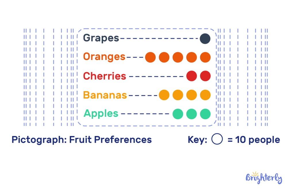
Below is a picture graph of the scale that shows the preference for fruits according to the data given.

What best sums up the information shown on the graph?
Each symbol ⚫ means 10 people and the graph represents the number of people who prefer each fruit. There is an easy way to calculate the value of each category using the following formula. The formula is:
Value of a category = N × S
Here, N stands for the number of symbols and S is the value of each of the symbols regarded. For example, with one symbol representing 10 people, if you have 3 symbols, then the value is 3 multiplied by 10, which is 30. This formula makes it easy to arrive at the data in each category within a short time.
From the pictograph above, we can see that “Apples” has 3 ⚫symbols, so 30 people like apples and “Oranges” has 5 ⚫symbols, so 50 people like oranges. Grapes are the least favorite with only one ⚫ symbol, which represents 10 individuals’ preferences.
This method makes the data simple and one is able to identify which fruit is more or less popular among consumers. This is how easy it is to read pictographs: As you remember, a symbol in a pictograph can only count as one unit.
When To Use a Pictograph?
If you are wondering about when one should use a pictograph, here are some great times to use them in pictograph math:
- Using pictographs is ideal when one wants to compare categories. If you want to compare the size of the group, for instance, the pictures on the graph help to grasp this. It is easy to compare amounts by just counting the symbols used to represent them.
- If you are trying to monitor data over time, then a pictograph can be very helpful. For instance, you can demonstrate what sales, weather or class attendance has been like for the past year or month.
- Surveys are also easy to conduct using pictographs. It makes it easy to determine the number of people who prefer one thing over the other. It is a convenient method of presenting results in a way that does not inundate the reader.
So, math can be more entertaining and fun by using the picture graph for kids. Pictures on a graph make data more meaningful.
Solved Math Tasks: Examples
In this section, we’ll be learning how to solve math problems with the help of picture graphs. Now let me show you some of them in use!
Solved Math Task 1: Counting Total Items
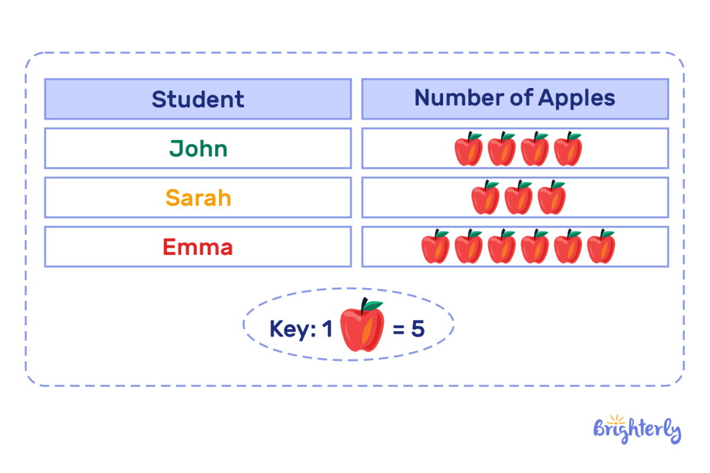
Key: 1 🍎 = 5

Question: How many apples were picked in total?
Answer: Count the symbols.
John picked 20 apples.
Sarah picked 15 apples.
Emma picked 30 apples.
|
So, the total apples picked are 20 + 15 + 30 = 65 apples. |
Solved Math Task 2: What are the pet preferences among people?

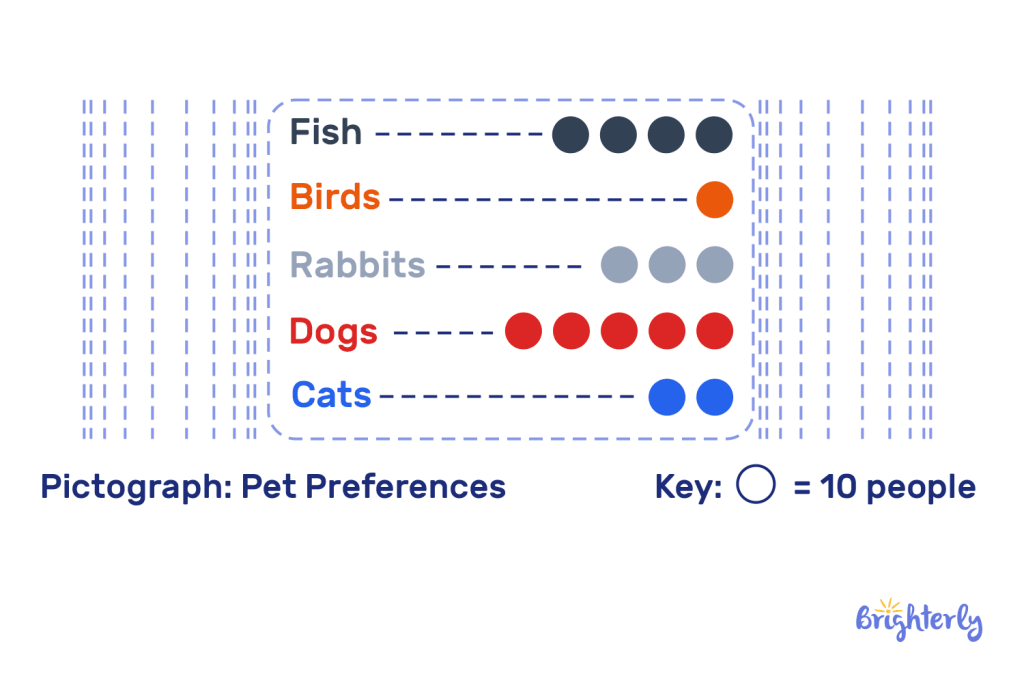
Let’s solve this math task using the pictograph of pet preferences! Each dot represents 10 people.
Fish: There are 5 dots, so 5 x 10 = 50 people prefer fish.
Birds: Only 1 dot appears, meaning 10 people prefer birds.
Rabbits: 3 dots are shown, which means 30 people prefer rabbits.
Dogs: 6 dots are visible, so 6 x 10 = 60 people prefer dogs.
Cats: There are 2 dots, meaning 20 people prefer cats.
| From the graph, dogs are the most popular pet choice, while birds are the least popular. |
Picture Graph: Practice Math Problems
Picture Graph: Worksheets
Our Picture Graph Worksheets are designed to help you improve your data interpretation skills. They assist you in thinking visually about information and developing mathematical skills. The worksheets are engaging, colorful and simple to use. You will feel more comfortable reading graphs and analyzing trends when solving real-life problems in a basic manner. Feel free to try them out now!


